In today’s fast-paced digital landscape, having a Mobile Responsive Website is no longer just an option—it’s a necessity. As users increasingly rely on mobile devices for browsing, shopping, and social interaction, ensuring your website adapts seamlessly across all screen sizes is crucial for maintaining a competitive edge.
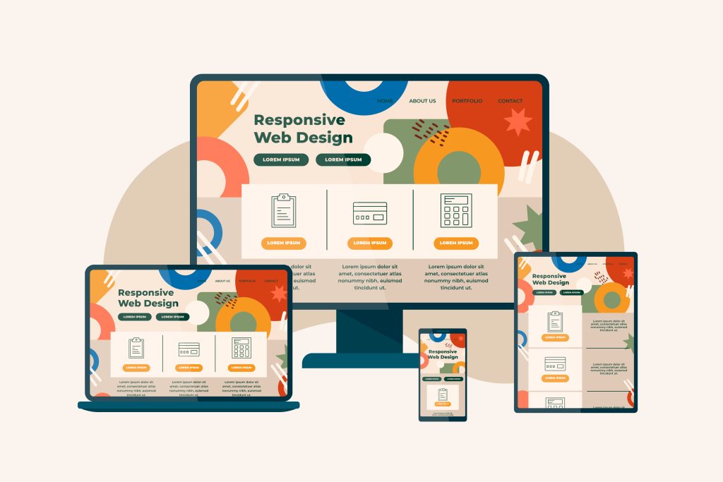
Understanding Mobile Responsiveness
A Mobile Responsive Website automatically adjusts its layout and appearance to fit the screen size of the device being used, whether it’s a smartphone, tablet, or desktop. This fluidity ensures a consistent and user-friendly experience, regardless of how visitors access your site.
With a growing number of users preferring mobile devices over traditional PCs or laptops, optimizing your website to meet their needs is imperative. A responsive design not only enhances user experience but also improves your site’s performance in search engine rankings.
Why Choose a Mobile Responsive Website Over a Mobile-Friendly One?
While both mobile-friendly and mobile-responsive designs aim to improve the user experience on mobile devices, they differ significantly in execution.
A mobile-friendly website is essentially a scaled-down version of a desktop site. It may work well enough on smaller screens, but users often encounter difficulties with navigation, scrolling, and input due to the reduced size. This can lead to frustration, particularly when it comes to clicking buttons or entering information—what we call the “fat-finger” problem.
On the other hand, a mobile-responsive website is designed to reformat and resize content dynamically based on the device’s screen size. This ensures that users enjoy a smooth and intuitive experience, with elements like buttons and images automatically adjusting for optimal interaction. The result is a website that feels just as functional and accessible on a mobile screen as it does on a desktop.
Top Reasons to Invest in a Mobile Responsive Website
- Future-Proof Your Website: In the past, websites required separate versions for different devices—a time-consuming and costly approach. Today, responsive design eliminates this need by automatically adapting to any screen size. As new devices and screen resolutions enter the market, a mobile responsive design ensures your website remains compatible, reducing the need for constant updates and redesigns.
- Improve Load Times and Reduce Bounce Rates: Speed is a critical factor in retaining visitors and preventing high bounce rates. Mobile-responsive websites are optimized to load quickly, providing users with immediate access to your content. In contrast, mobile-friendly sites often suffer from slower load times, which can drive potential customers away. By choosing a responsive design, you enhance user experience and keep your audience engaged.
- Boost SEO Performance: Search engines like Google prioritize mobile-responsive websites in their rankings. This preference is due to the ease with which search engines can crawl and index content from responsive sites. As a result, a mobile-responsive design not only enhances user experience but also improves your visibility in search engine results, driving more organic traffic to your site. For more insights on improving your site’s SEO, check out Neil Patel’s blog.
- Enhanced User Experience: A responsive design ensures that users can easily navigate, click, and view content on your website, regardless of the device they use. This adaptability is key to keeping visitors on your site longer and encouraging them to return. As users’ expectations continue to evolve, a responsive website positions your business to meet and exceed those demands.
Professional Expertise Over DIY
Creating a mobile-responsive website is a complex task that requires professional expertise. While some may consider a DIY approach or hiring a freelancer, the intricacies of responsive design are best handled by experienced professionals. Cheritek, a premier web design company, specializes in crafting mobile-responsive websites that not only meet your current needs but also adapt to future technological advancements. By partnering with professionals, you ensure that your website is an asset that supports your long-term business goals. Learn more about how Cheritek can help you Unlock Digital Success.
Final Thoughts
In conclusion, investing in a mobile-responsive website is essential for any business looking to thrive in today’s digital world. Not only does it enhance user experience and improve search engine rankings, but it also future-proofs your site against the ever-changing landscape of technology. As the foundation of your online presence, a responsive website is a strategic investment in your business’s future success.